Your website is the point of reference for your customers.
You need to provide awesome user experience to your website visitors. And to achieve this you need to put your customers’ needs first.
How? By understanding why they are visiting your website and providing the right answers that meet their needs.
Digital marketing has developed over the years and the power of a website with it.
However, you need to stay up-to-date with changing marketing trends, to make your website an effective tool that it is.
There are certain values you must integrate into your website if you want users to stick around and trust you.
An aging website will more often than not require a redesign, which might be time-consuming or outside your budget.
To that note, this article focuses on 10 easy to implement steps to improve your website user experience.
1). Design With White Space
In my experience optimizing websites for different clients, I have found that most initial website designs include limited white spaces.
I mean why leave white space when you can advertise more, right? I’m sorry to disappoint you, but white space is imperative for good design and great user experience.
Big companies like Google, Apple, Samsung use a whitespace-style of web design.
Too much design can distract users from the main elements of the page.
According to Crazy Egg, “by designing your pages with white space around important text and titles, there’s a 20% increase in drawing users’ attention.”
That said, using white space has a downside, which is the amount of space it takes.
It’s therefore fair to say that finding the balance between using white space for the most important information at the top is imperative.
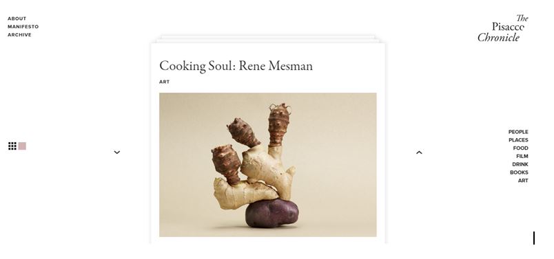
A good example of a website with whitespace design is The Pisacco Chronicle, an online food magazine.
Here, the homepage is pretty simple, with a unique positioning of the title and navigation tab.
This website manages to capture the user’s attention, without unnecessary distractions. Note that the position of the navigation tab might have been an issue if there were more content on the page.
2). Optimize Your Page Speed
The speed at which your site loads is very important.
Because site speed is the first thing visitors notice when they land on your website.
This would, to some extent, decide if visitors would stay or leave your site. Therefore, if you don’t want a high bounce or abandonment rate, you need to first optimize your site speed.
In a study by MobileMadness on Site speed, 46% of people say waiting for pages to load is what they dislike most about browsing the web on mobile.
Therefore, doing everything possible to make sure your site responds as fast as possible is imperative.
You can take the extra step to resize your images using free online tools like Compressor.io to optimize your website.
Another way Google puts its users first is by providing the necessary tools to make our work easier.
In this case, Google’s Test My Mobile Site tool enables you to test the speed of your mobile website, offering suggestions on what to fix.
3). Use Captivating Calls to Action
The next tip on our list is the use of proper and captivating calls-to-action (CTAs).
Generally, calls to action involve the use of action words that will draw a user’s attention to taking an action.
Calls-to-action (CTAs) must be specific and straight to the point. This way, users can easily take the action you want them to.
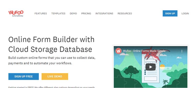
A case study to learn from is WUFOO. The use of CTAs on this company’s website is top-notch, and it encourages users to take the next step.
Calls to action are buttons leading to action pages. When designing these buttons, you must understand color and psychology.
In a marketing survey by Maxymiser, researchers tested different color variations and action messaging for a call to action leading to a website’s checkout area.
The survey recorded an increase of 11% in clicks.
Another notable consideration for CTAs is the actual words leading to the click.
It’s called a CTA for a reason, therefore the words must include action words that would excitingly answer a user’s need. Find the right words to connect to your audience.
4). Use Hyperlink Differentiation
Links are meant to be clicked. Therefore, making your links easily visible or accessible to users is imperative.
Texts and colors, different from the original page format draw user attention. They prompt the user to take notice.
According to Karyn Graves, “an average web user identifies the color blue as links, as well as underlined text.”
Exploiting user behaviors, what they expect, and what they are attracted to, is one of the best tactics to creating an awesome user experience.
Hyperlink differentiation doesn’t mean changing the norm. Maintaining a conventional design known to users can be your best ally here.
Another hyperlink differentiation point is the length of the hyperlink titles. For example, “To check out the Worldometer website click here.” vs “Check out the Worldometer website here”
5). Segment Key Information With Bullet Points.
Bullet points help users separate main points or instructions from the whole page. This way users get quick access to what they want. For example; how your site works or how you can solve their problems. This will give your website a more structured look, making your proposition more attractive.
The conventional circle isn’t the only option for creating bullet points. There are numerous icons you can use to represent bullet points.
You can go as far as using images that represent your point.
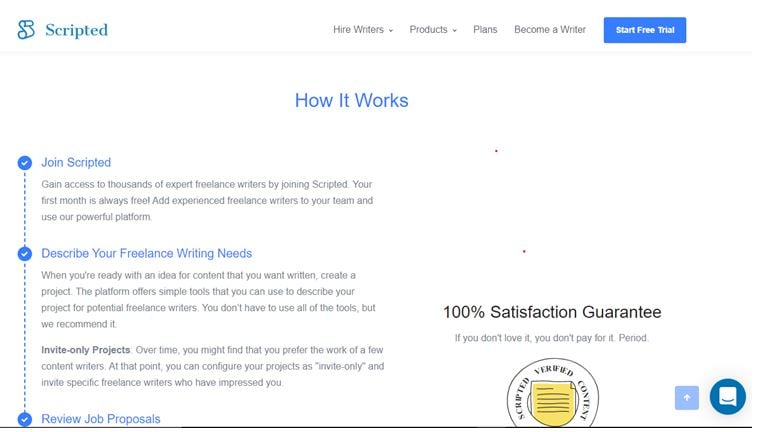
One great example of good use of bullet points comes from Scripted. On this company’s homepage, icons are used to describe how they offer services.
6). Use Images Correctly
The world is getting smarter with every passing year, users tend to judge websites before deciding on taking action.
One of the first things noticeable by users on a site is images. Users can quickly spot images they’ve seen elsewhere or stock images. This can reduce trust.
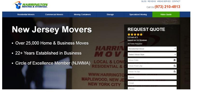
For example, Harrington Movers and Storage, a New Jersey moving company saw a 45.45% increase in conversion from the simple act of replacing stock images with team members’ images.
The crux of the matter is that, although stock photos are of high quality, they don’t create a much-coveted user connection with the brand.
Use images correctly, and use images that fully convey your brand message, your products, and services.
7). Properly Design Your Headings
Oftentimes, successful websites are those with the best headings.
What are the best headings? Headings that are user-driven and include keywords. User-driven in the sense that it includes answers to what your audience is searching for.
Google considers headings an essential part of the content page. Hence, the right heading with the right keywords can also make you rank higher in search engines.
A good example to learn from is Tilde. Here you can see how outstanding the headings are. Corresponding to the content that follows.
When it comes to user experience, which is the focus of this article, headings make navigating your website and its pages easier for users.
8). Maintain Consistency in Website Pages
Consistent website pages build brand trust.
It gives users a clear understanding of what your brand is about. Matching heading size, font family, font size, buttons, spacing, and much more.
You can use the same theme for every page, keeping the whole website design coherent. Scripted is a great example of consistent design.
There is a sense of what the company is about on every page.
Great user experience involves giving your users the right feeling that they are still on your site, regardless of the page they are on.
Making drastic design changes to different pages can end up confusing users. Make sure you maintain what you are about with consistent website pages.
9). Avoid 404s Error Pages
Although Google doesn’t penalize you for having 404 error pages. However, users do not like to see such pages. And if users aren’t happy, Google will soon get pissed!
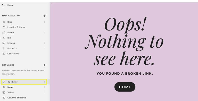
A link is meant to lead users to a page they had in mind before clicking it. If it doesn’t you can as well buy yourself a big bag for bounce rates.
In other words, a 404 error page means a poor user experience. From personal experience, 404 error pages are highly frustrating.
How can you know if your links lead to a 404 page? One reliable way is to check your Google Search Console. When you’re logged in, simply crawl your website for errors.
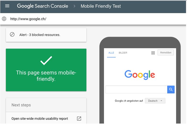
10). Design a Mobile-Friendly Website
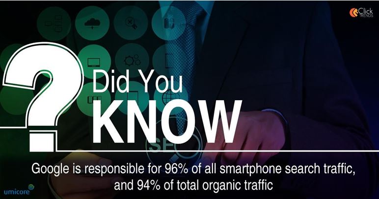
Considering the development of more sophisticated Smartphones every passing year, it is no surprise that a bulk of search engine queries come from mobile devices.
This is because with mobile phones you can access information on the go.
In a world where a large percentage of the population uses a Smartphone, you can quickly boost your traffic by making your website mobile-friendly and responsive.
Having optimized your website, you need to make sure it’s accessible from a mobile device.
Conclusion
If your website isn’t easily accessible from a mobile device, you will find visitors quickly exiting your page, resulting in a high bounce rate.
Google detects this high bounce rate and you may lose your ranking, which isn’t good for SEO, and your business.
If you need some help with your SEO strategy for 2020, you can speak with our digital marketing expert today.